(Re)designing logotypes are my favorite part of lettering work. Building characters from scratch, designing them in a way they represent the values and standards of the company or product, I love it! Read along to get to know my process.



Research is an essential part of any (logo) design process. It creates an opportunity to discuss expectations, as well as the message that the logo should convey. As the possibilities of custom lettering are endless, research is necessary to find the right direction.
After research comes sketching, the most crucial part of the process. This part starts with an extensive amount of hand drawn sketches, often using or combining techniques of calligraphy, brush lettering and hand lettering. One to three (depending on budget and further agreements) sketches are further developed and send to the client.
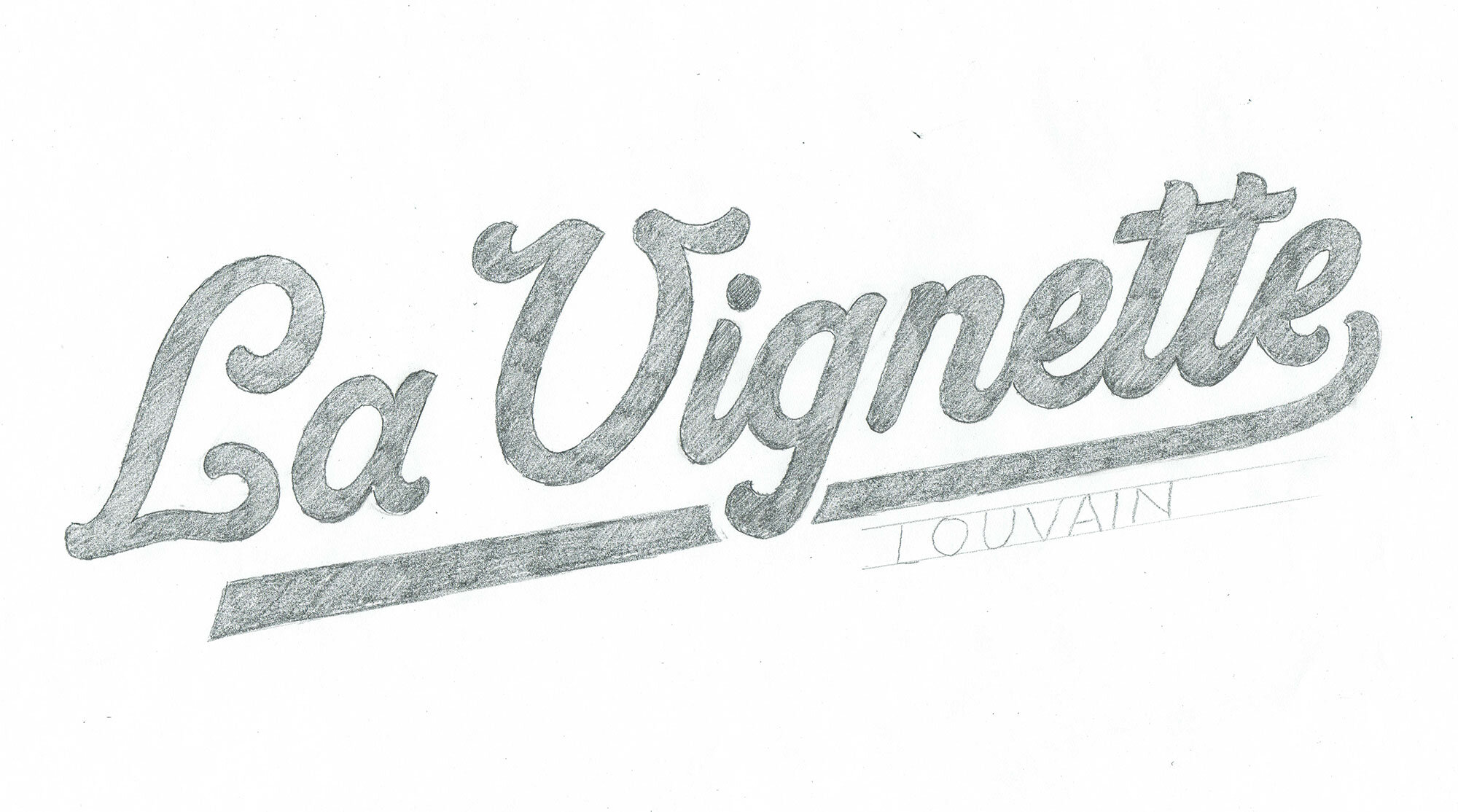


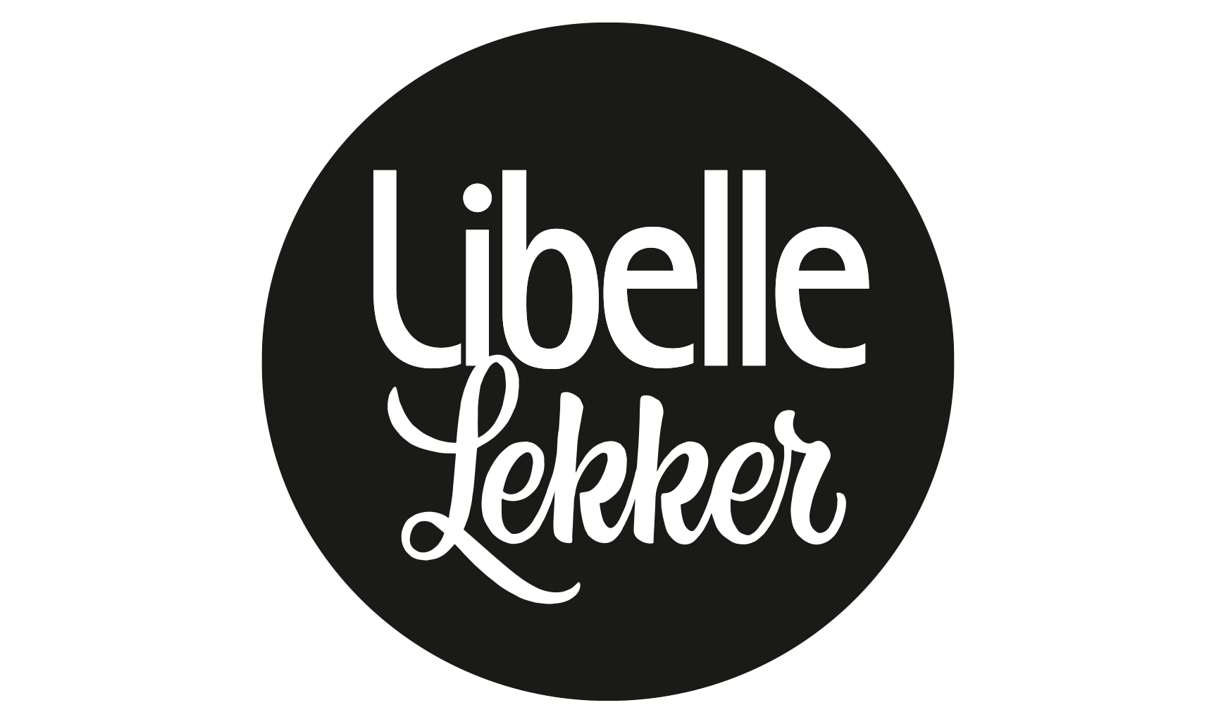


When the sketch is approved by the client, the work continues digitally with a vectorized version of the logotype. Every logo designed from scratch needs a supporting visual brand identity, which can be very limited or extensive – depending on the purpose of the project. This identity generally includes matching typefaces, a colour scheme and a set of images or photography.


When working on a logotype commissioned by an advertising or graphic agency, the brand identity often has been determined in advance. In this case, the agency makes the decision to push the logotype to the next level by choosing custom lettering over the use of an existing typeface.
A choice I can only encourage! ;-)
Custom lettering is a time-intensive technique. This results in a unique and distinctive logotype, that expresses the brands’ story. By designing a logo that is not time or trend sensitive - except when specifically requested - you get a design that can last for a long time.
